
Optional caption text
Optional caption text
 ============================================================ */
/* ── Outer wrapper ── */
.phones {
display: grid;
gap: clamp(1.5rem, 3vw, 3rem);
margin-top: var(--space-12);
justify-items: center;
align-items: start;
}
/* Column variants */
.phones--1 { grid-template-columns: 1fr; max-width: 320px; margin-left: auto; margin-right: auto; }
.phones--2 { grid-template-columns: repeat(2, 1fr); max-width: 680px; margin-left: auto; margin-right: auto; }
.phones--3 { grid-template-columns: repeat(3, 1fr); }
.phones--4 { grid-template-columns: repeat(4, 1fr); }
/* Stack to single column on mobile for all variants */
@media (max-width: 700px) {
.phones--2,
.phones--3,
.phones--4 {
grid-template-columns: repeat(2, 1fr);
}
}
@media (max-width: 480px) {
.phones--3,
.phones--4 {
grid-template-columns: repeat(2, 1fr);
}
}
/* ── Single phone unit ── */
.phone {
display: flex;
flex-direction: column;
align-items: center;
gap: 1rem;
width: 100%;
}
/* ── The outer frame (bezel) ── */
.phone__frame {
position: relative;
width: 100%;
max-width: 260px;
/* Aspect ratio of a typical modern phone (19.5:9 → 9:19.5) */
aspect-ratio: 9 / 19.5;
border-radius: 36px;
background: #1a1a1a;
box-shadow:
0 0 0 2px #2e2e2e, /* inner ring */
0 0 0 3px #111, /* gap */
0 0 0 5px #2a2a2a, /* outer rim */
0 24px 60px rgba(0,0,0,0.6), /* drop shadow */
0 8px 20px rgba(0,0,0,0.4);
overflow: visible;
}
/* The screen cutout */
.phone__screen {
position: absolute;
inset: 12px;
border-radius: 26px;
overflow: hidden;
background: #000;
}
/* Dynamic island notch — removed so it doesn't overlap the screenshots */
.phone__frame::before {
content: none;
display: none;
}
/* Side buttons — left */
.phone__frame::after {
content: '';
position: absolute;
left: -5px;
top: 90px;
width: 4px;
height: 34px;
background: #2a2a2a;
border-radius: 2px 0 0 2px;
box-shadow: 0 50px 0 #2a2a2a, 0 92px 0 #2a2a2a;
}
/* Power button — right */
.phone__power {
position: absolute;
right: -5px;
top: 120px;
width: 4px;
height: 48px;
background: #2a2a2a;
border-radius: 0 2px 2px 0;
z-index: 5;
pointer-events: none;
}
/* ── Scrollable screenshot image ── */
.phone__img {
display: block;
width: 100%;
height: auto;
/* The image can be taller than the screen — it scrolls */
cursor: grab;
}
.phone__img:active { cursor: grabbing; }
/* While the image hasn't loaded / is a placeholder */
.phone__screen .placeholder-img {
width: 100%;
height: 100%;
aspect-ratio: unset;
border-radius: 0;
border: none;
}
.phone__screen .placeholder-img .placeholder-img__label {
font-size: 0.6rem;
padding: 0.5rem;
}
/* ── Smooth auto-scroll behaviour (JS-driven) ── */
.phone__screen {
overflow-y: auto;
overflow-x: hidden;
scroll-behavior: smooth;
-webkit-overflow-scrolling: touch;
/* Hide scrollbar visually */
scrollbar-width: none;
}
.phone__screen::-webkit-scrollbar { display: none; }
/* ── Optional caption below each phone ── */
.phone__caption {
font-size: 0.75rem;
font-family: var(--font-mono, 'JetBrains Mono', monospace);
letter-spacing: 0.08em;
text-transform: uppercase;
color: var(--color-text-muted, #8a8a85);
text-align: center;
max-width: 220px;
}
/* ── Desktop variant (wider frames) ── */
.phones--desktop .phone__frame {
max-width: 100%;
aspect-ratio: 16 / 10;
border-radius: 16px;
}
.phones--desktop .phone__frame::before {
/* Webcam dot instead of island */
width: 10px;
height: 10px;
border-radius: 50%;
top: 10px;
}
.phones--desktop .phone__frame::after {
display: none; /* no side buttons on desktop mockup */
}
.phones--desktop .phone__screen {
inset: 8px;
border-radius: 10px;
}
/* ── Section wrapper with eyebrow label ── */
.phones-section {
margin-top: var(--space-12);
}
.phones-section__label {
font-family: var(--font-mono, 'JetBrains Mono', monospace);
font-size: 0.6875rem;
letter-spacing: 0.12em;
text-transform: uppercase;
color: var(--color-text-muted, #8a8a85);
margin-bottom: var(--space-6);
}
/* ============================================================
DEVICE SHOWCASE — laptop + phone side by side
(laptop screen coords derived from laptop-mockup.webp)
============================================================ */
.device-showcase {
display: flex;
align-items: flex-end;
justify-content: center;
gap: var(--space-8);
margin-top: var(--space-8);
}
.device-showcase__laptop { flex: 1 1 auto; min-width: 0; max-width: 780px; }
.device-showcase__phone { flex: 0 0 auto; width: 232px; }
.device-showcase__phone .phone__frame { max-width: 232px; }
/* Laptop mockup: PNG frame on top, screen scrolls behind the transparent screen cutout */
.laptop-mock { position: relative; width: 100%; }
.laptop-mock__frame {
position: relative;
width: 100%;
display: block;
z-index: 2;
pointer-events: none;
}
.laptop-mock__screen {
position: absolute;
top: 6.28%;
left: 10.17%;
right: 10.17%;
bottom: 11.07%;
overflow-y: auto;
overflow-x: hidden;
z-index: 1;
background: #fff;
-webkit-overflow-scrolling: touch;
scrollbar-width: none;
cursor: grab;
}
.laptop-mock__screen::-webkit-scrollbar { display: none; }
.laptop-mock__screen img { width: 100%; height: auto; display: block; }
@media (max-width: 768px) {
.device-showcase__laptop { display: none; }
.device-showcase__phone { width: 100%; max-width: 300px; margin: 0 auto; }
.device-showcase__phone .phone__frame { max-width: 300px; }
}
/* ============================================================
PERSISTENT CHAT OVERLAY
------------------------------------------------------------
A chat input bar pinned to the bottom of the phone screen.
The screenshot inside .phone__screen scrolls; .phone__chat is
a sibling of the screen, so it stays fixed — creating the
effect of an active conversation layered over the screens.
============================================================ */
/* ── Outer wrapper ── */
.phones {
display: grid;
gap: clamp(1.5rem, 3vw, 3rem);
margin-top: var(--space-12);
justify-items: center;
align-items: start;
}
/* Column variants */
.phones--1 { grid-template-columns: 1fr; max-width: 320px; margin-left: auto; margin-right: auto; }
.phones--2 { grid-template-columns: repeat(2, 1fr); max-width: 680px; margin-left: auto; margin-right: auto; }
.phones--3 { grid-template-columns: repeat(3, 1fr); }
.phones--4 { grid-template-columns: repeat(4, 1fr); }
/* Stack to single column on mobile for all variants */
@media (max-width: 700px) {
.phones--2,
.phones--3,
.phones--4 {
grid-template-columns: repeat(2, 1fr);
}
}
@media (max-width: 480px) {
.phones--3,
.phones--4 {
grid-template-columns: repeat(2, 1fr);
}
}
/* ── Single phone unit ── */
.phone {
display: flex;
flex-direction: column;
align-items: center;
gap: 1rem;
width: 100%;
}
/* ── The outer frame (bezel) ── */
.phone__frame {
position: relative;
width: 100%;
max-width: 260px;
/* Aspect ratio of a typical modern phone (19.5:9 → 9:19.5) */
aspect-ratio: 9 / 19.5;
border-radius: 36px;
background: #1a1a1a;
box-shadow:
0 0 0 2px #2e2e2e, /* inner ring */
0 0 0 3px #111, /* gap */
0 0 0 5px #2a2a2a, /* outer rim */
0 24px 60px rgba(0,0,0,0.6), /* drop shadow */
0 8px 20px rgba(0,0,0,0.4);
overflow: visible;
}
/* The screen cutout */
.phone__screen {
position: absolute;
inset: 12px;
border-radius: 26px;
overflow: hidden;
background: #000;
}
/* Dynamic island notch — removed so it doesn't overlap the screenshots */
.phone__frame::before {
content: none;
display: none;
}
/* Side buttons — left */
.phone__frame::after {
content: '';
position: absolute;
left: -5px;
top: 90px;
width: 4px;
height: 34px;
background: #2a2a2a;
border-radius: 2px 0 0 2px;
box-shadow: 0 50px 0 #2a2a2a, 0 92px 0 #2a2a2a;
}
/* Power button — right */
.phone__power {
position: absolute;
right: -5px;
top: 120px;
width: 4px;
height: 48px;
background: #2a2a2a;
border-radius: 0 2px 2px 0;
z-index: 5;
pointer-events: none;
}
/* ── Scrollable screenshot image ── */
.phone__img {
display: block;
width: 100%;
height: auto;
/* The image can be taller than the screen — it scrolls */
cursor: grab;
}
.phone__img:active { cursor: grabbing; }
/* While the image hasn't loaded / is a placeholder */
.phone__screen .placeholder-img {
width: 100%;
height: 100%;
aspect-ratio: unset;
border-radius: 0;
border: none;
}
.phone__screen .placeholder-img .placeholder-img__label {
font-size: 0.6rem;
padding: 0.5rem;
}
/* ── Smooth auto-scroll behaviour (JS-driven) ── */
.phone__screen {
overflow-y: auto;
overflow-x: hidden;
scroll-behavior: smooth;
-webkit-overflow-scrolling: touch;
/* Hide scrollbar visually */
scrollbar-width: none;
}
.phone__screen::-webkit-scrollbar { display: none; }
/* ── Optional caption below each phone ── */
.phone__caption {
font-size: 0.75rem;
font-family: var(--font-mono, 'JetBrains Mono', monospace);
letter-spacing: 0.08em;
text-transform: uppercase;
color: var(--color-text-muted, #8a8a85);
text-align: center;
max-width: 220px;
}
/* ── Desktop variant (wider frames) ── */
.phones--desktop .phone__frame {
max-width: 100%;
aspect-ratio: 16 / 10;
border-radius: 16px;
}
.phones--desktop .phone__frame::before {
/* Webcam dot instead of island */
width: 10px;
height: 10px;
border-radius: 50%;
top: 10px;
}
.phones--desktop .phone__frame::after {
display: none; /* no side buttons on desktop mockup */
}
.phones--desktop .phone__screen {
inset: 8px;
border-radius: 10px;
}
/* ── Section wrapper with eyebrow label ── */
.phones-section {
margin-top: var(--space-12);
}
.phones-section__label {
font-family: var(--font-mono, 'JetBrains Mono', monospace);
font-size: 0.6875rem;
letter-spacing: 0.12em;
text-transform: uppercase;
color: var(--color-text-muted, #8a8a85);
margin-bottom: var(--space-6);
}
/* ============================================================
DEVICE SHOWCASE — laptop + phone side by side
(laptop screen coords derived from laptop-mockup.webp)
============================================================ */
.device-showcase {
display: flex;
align-items: flex-end;
justify-content: center;
gap: var(--space-8);
margin-top: var(--space-8);
}
.device-showcase__laptop { flex: 1 1 auto; min-width: 0; max-width: 780px; }
.device-showcase__phone { flex: 0 0 auto; width: 232px; }
.device-showcase__phone .phone__frame { max-width: 232px; }
/* Laptop mockup: PNG frame on top, screen scrolls behind the transparent screen cutout */
.laptop-mock { position: relative; width: 100%; }
.laptop-mock__frame {
position: relative;
width: 100%;
display: block;
z-index: 2;
pointer-events: none;
}
.laptop-mock__screen {
position: absolute;
top: 6.28%;
left: 10.17%;
right: 10.17%;
bottom: 11.07%;
overflow-y: auto;
overflow-x: hidden;
z-index: 1;
background: #fff;
-webkit-overflow-scrolling: touch;
scrollbar-width: none;
cursor: grab;
}
.laptop-mock__screen::-webkit-scrollbar { display: none; }
.laptop-mock__screen img { width: 100%; height: auto; display: block; }
@media (max-width: 768px) {
.device-showcase__laptop { display: none; }
.device-showcase__phone { width: 100%; max-width: 300px; margin: 0 auto; }
.device-showcase__phone .phone__frame { max-width: 300px; }
}
/* ============================================================
PERSISTENT CHAT OVERLAY
------------------------------------------------------------
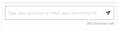
A chat input bar pinned to the bottom of the phone screen.
The screenshot inside .phone__screen scrolls; .phone__chat is
a sibling of the screen, so it stays fixed — creating the
effect of an active conversation layered over the screens.
Final Design